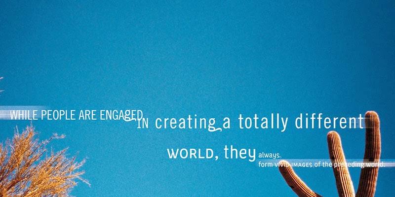
Over the weekend I enjoyed moving away from hand-lettering and painting type, to printing, cutting, taping, and scanning type. Here are some of my explorations:
I've begun the process of adding and combining my explorations (and the rest of the project's content) onto the form of the box – it is quite challenging. I spoke with Kidwell today and he mentioned trying monotone and duotone colors on these scanned images, I've been having fun experimenting with that!
Tuesday, March 31, 2015
Sunday, March 29, 2015
type 2: chance/design
Last class we started an exercise called chance/design. Here are the basic steps:
1) Plot out the size and basic shape of the cereal box.
2) Divide the box into 16 sections (4 x, 4 y).
3) Divide the design content into 12 portions.
4) Flip a coin to determine the typographic size, style, orientation, and location.
5) Place and adjust the above attributes (determined by steps 3, 4) onto the cereal box.
Below are three of my results:
It was an interesting exercise. After seeing my results, I can honestly say I would never have come up with these designs if it weren't for chance. Looking forward, this exercise will be a good reminder to have fun and be playful during the design process.
Thursday, March 26, 2015
type 2: 3.26
Since last week, I've done a lot of experimenting! The below images are all hand-drawn / painted – I used a variety of mediums: ink, pastels, foam cut-outs, watercolors, acrylics, and ink pens. After experimenting, I scanned them in and started experimenting with color, layout, orientation, etc. There's still a lot of experimentation and development ahead of me, but here are my explorations:

(I want to make the star shape out of type to meet criteria)
These were leftovers from the peel & stick foam I cut and used in some of the above experiments. I learned that it was really fun and easy to rearrange the letters in different compositions. I actually came up with 52 different compositions, below are a few photos of my favorites:
Tuesday, March 24, 2015
type 2 – 3.24
For our first type 2 project with our new professor, Kidwell, we are designing the Rice Krispies box using type only. The final product will be 3 unique Rice Krispies boxes, each evoking a different attribute. The guiding attributes are: order, energy, comfort, confidence, informational, interdependence and refinement.
The homework from our first class was to EXPLORE type…outside of the computer. So,
I gathered some of my supplies (watercolors, pencils, sharpies) and explored. I tried to evoke 6 of the above attributes (excluding informational), here's what I created:
order

energy
comfort
interdependence
refinement
confidence
For the next step, I plan on expanding my work and exploring more mediums…I mostly used sharpies this time which makes them look rather similar. I also plan on exploring the informational attribute once I explore a few options using the computer.
Friday, March 20, 2015
type 2: David Carson – TED Talk
David Carson is known as the “grunge typographer.” In the
1990s, as creator of the Ray Gun
magazine, he created new and energetic typographic layouts that broke the mold
of traditional typography.
This is what I took away from David Carson’s TED Talk (https://www.ted.com/speakers/david_carson):
1) On mistaking legibility for communication: “Just because
it’s legible doesn’t mean it communicates…doesn’t mean it communicates the
right thing.”
2) On living in a technically driven world: “The importance
of people becomes more than it’s ever been before. You have to utilize who you
are in your work. Nobody else can do that. Nobody else can pull from your
background, from your parents, your upbringing, your whole life experience. If
you allow that to happen, it’s really the only way you can do some unique work
and you’re going to enjoy the work a lot more as well.”
3) On the graphic design profession and choosing between
serif and sans serif fonts: “Not real life threatening. Why not experiment, why
not have some fun? Why not put some of yourself in the work?”
Subscribe to:
Comments (Atom)


